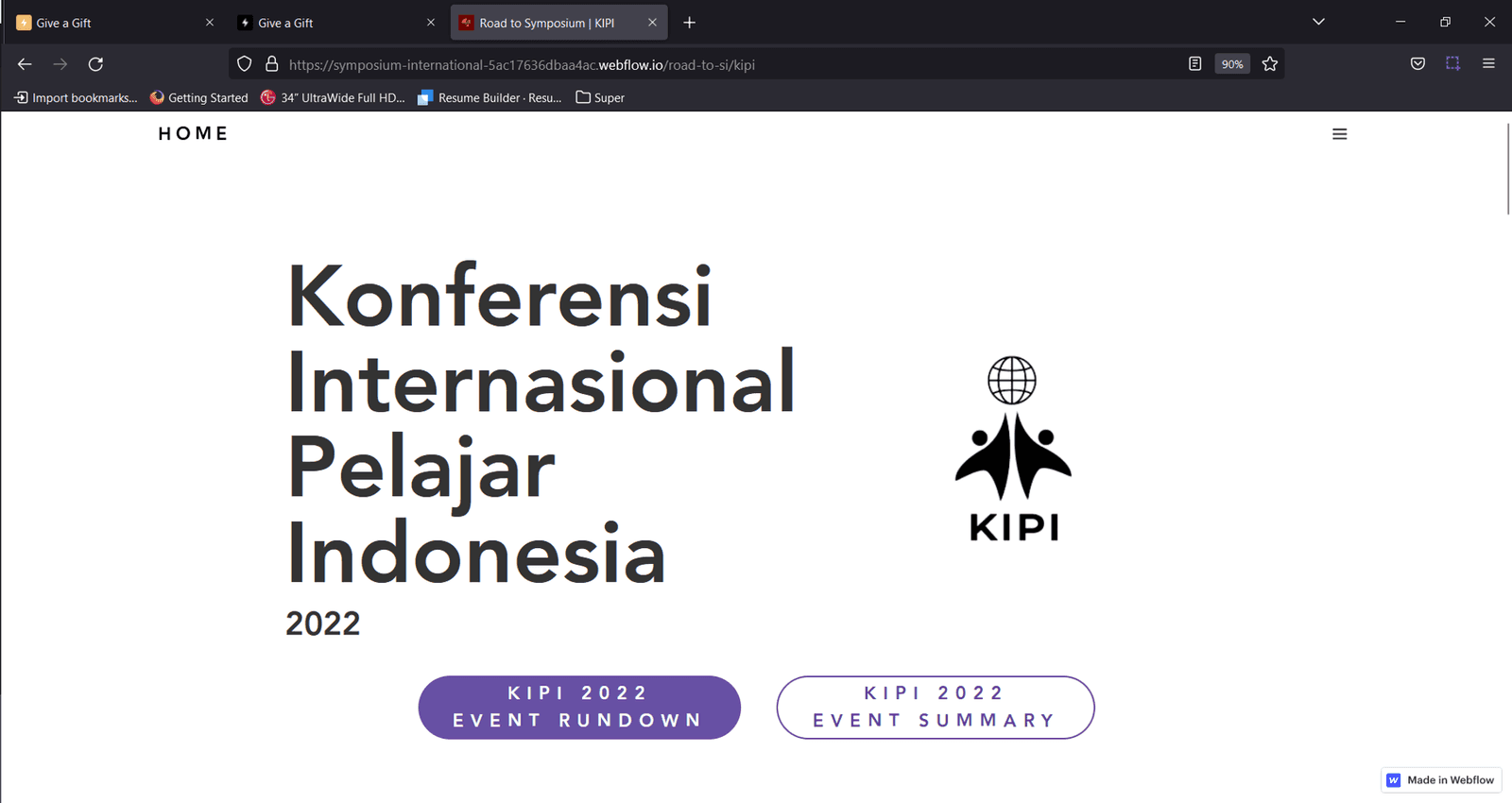
One symposium, three events, one website
Every year PPI Dunia holds an international symposium, and in 2022 PPI Australia was chosen to host Symposium International XIV. PPIA, the Indonesian Students' Association of Australia, spent about a year building up to it with a series of events called "Road to SI".
- KIPI, PPIA's hybrid international symposium
- Career Fest
- Symposium International XIV
I led the project to build one website for all three. This post follows KIPI 2022. Career Fest and the Symposium used the same tools and the same process, so one story covers them all.
Credible enough for academics, friendly enough for students
The site had to serve Indonesian students and researchers across Australia. It needed to feel academically credible without being stiff, handle registrations for more than one event, and show PPIA as the organised outfit it was.
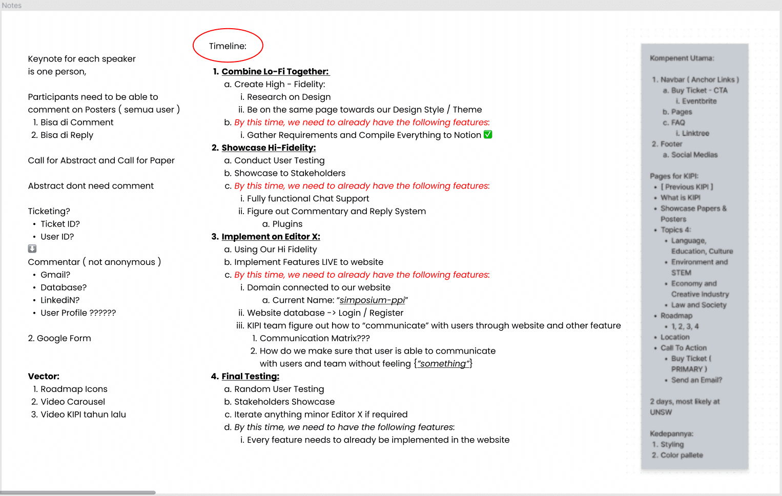
The plan: follow the Stanford design thinking process for three months, bring stakeholders along at every step, and design in Figma before building in Webflow.
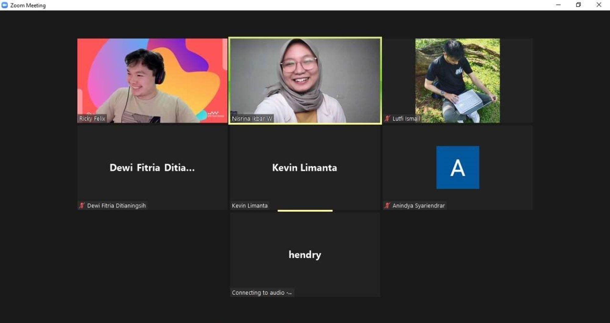
Grow the team, and keep everyone in the loop
With several projects on the go, the team kept growing, so we created an onboarding process to get new members up to speed quickly.
We also brought stakeholders in from day one. They helped us gather requirements, and we kept them updated at every step until launch.
Sketch the skeleton before the skin
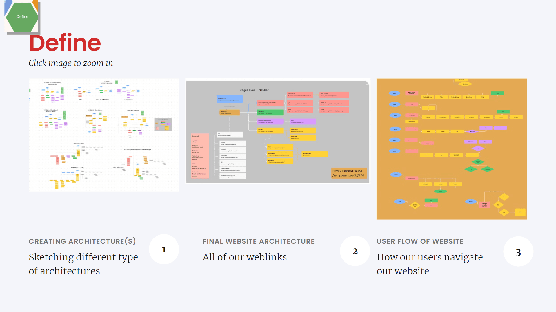
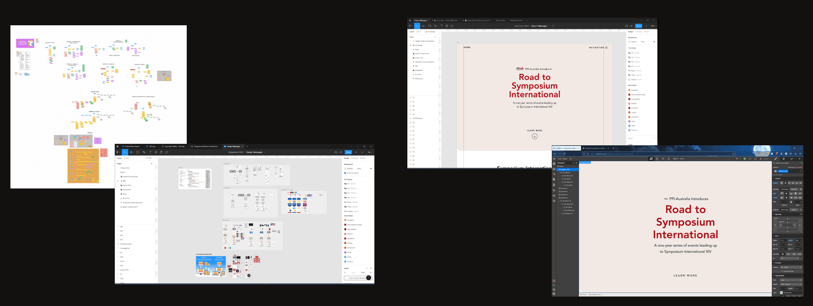
Before anyone picked a colour, we mapped the site. We sketched a few possible structures, settled on a final map of every page and link, then traced the routes users would take through it.
Only then did we start designing screens in Figma, and building them in Webflow.
Six rounds, and the "toy box" moment
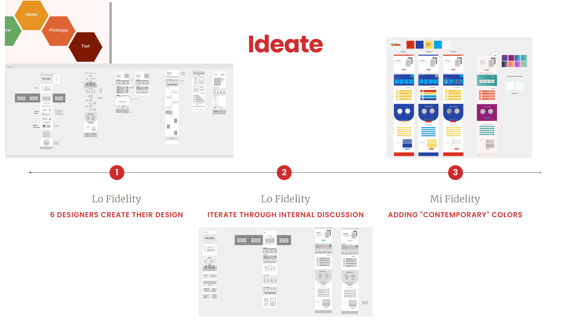
The design went through six rounds:
- Each of our six designers drew their own lo-fi version of the page.
- We compared them as a team and chose one to build on.
- We took it to mid-fidelity and gave it a bright, contemporary colour palette.
- We showed the stakeholders, and they didn't hold back.
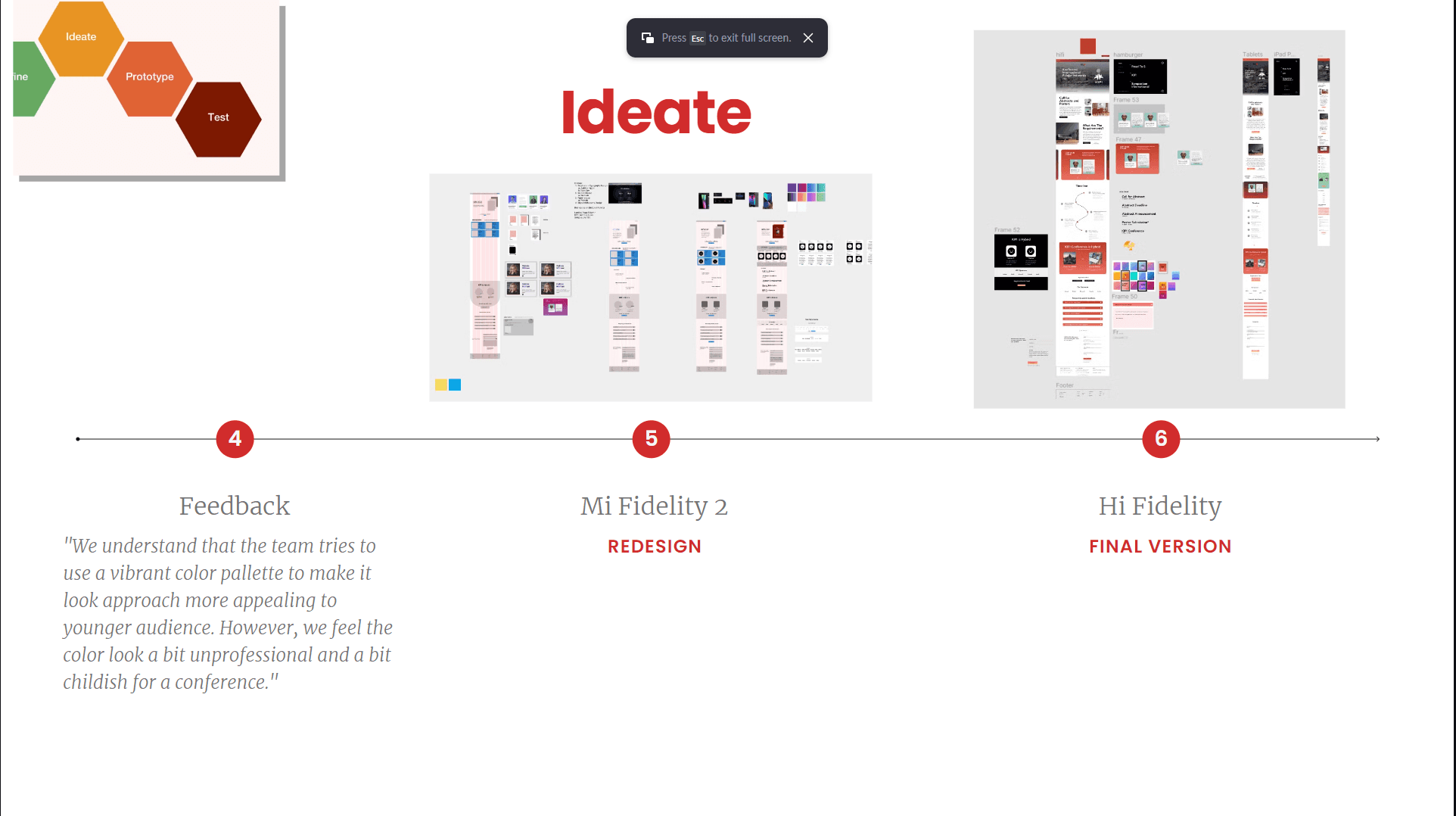
- We redesigned it from that feedback.
- We finished the hi-fi final version.
The stakeholders understood we were trying to appeal to a younger audience. But:
We feel the color look[s] a bit unprofessional and a bit childish for a conference.
In other words, it looked like a toy box. They were right: we were designing for a conference, not a kids' app.
Honest feedback in round four is far cheaper than a polished site nobody wants.
One last test, then launch
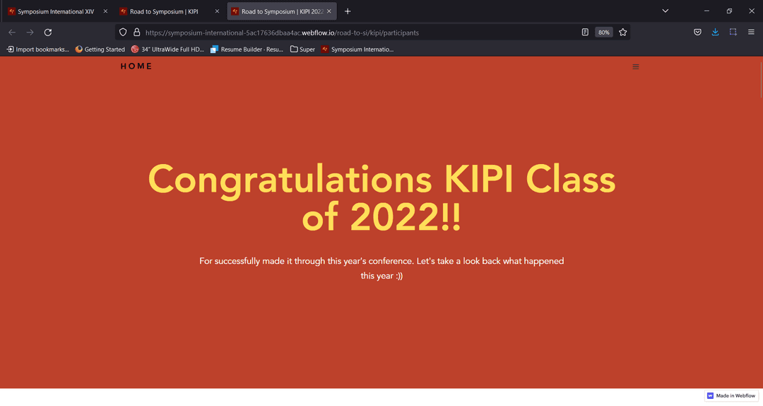
Close to the deadline, we ran a final usability test with people outside the team and used what we learned to polish the site before launch.
Then we did it twice more
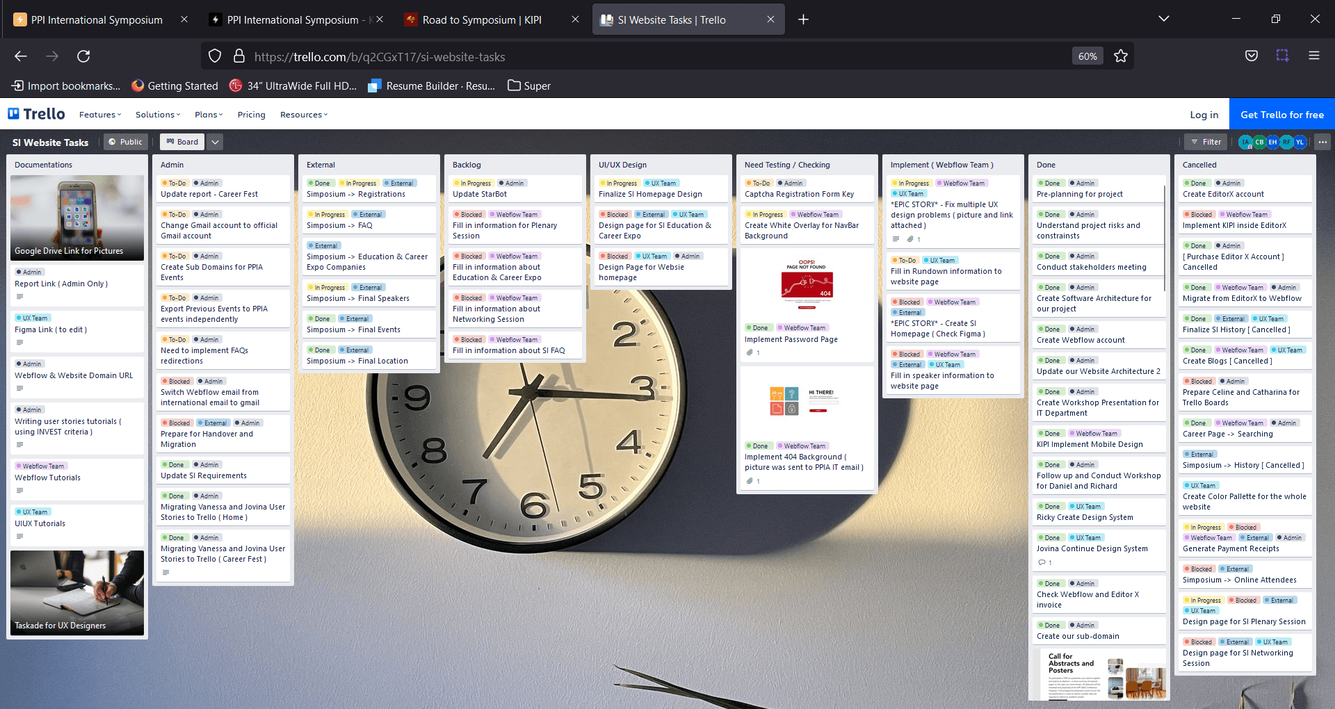
KIPI was only the first stop. Career Fest and the Symposium followed the same process, and we kept all three on schedule with agile sprints in Trello.
Three events, one platform, a year of use
The "Road to SI" website hosted all three events over the course of a year. Designing in the open and keeping stakeholders close gave Indonesian students and researchers across Australia a professional home online, and helped PPIA keep its reputation for running things well.
By the numbers
- Events hosted
- 3
- Design rounds
- 6
- Months to build
- 3
The short version
- Team and stakeholdersOnboarding for new members and regular stakeholder check-ins.
- Architecture and journeysMapped every page and the routes users take through them.
- Iterate on feedbackSix rounds from lo-fi to hi-fi, including the colour rethink.
- Usability testingA final test with outside users before launch.
- Agile deliverySprints in Trello across all three events.